
Among other very insightful comments, he questioned my decision to bring the terminals [the tip-ends of the ‘S’] all the way around. His point was that it seemed out of character with the style. He was right. So, I went back to trying to figure that out. I opened the terminals back up. Then I opened them up as far as I could. That looked awful. Then I brought them back a little. Then some more. Then some more. Eventually I settled into something that I thought worked. These tiny things may seem like inconsequential details but they are very important. I teach type design and I like to tell my students that while these minuscule changes won’t be noticed by most people, they will be felt.

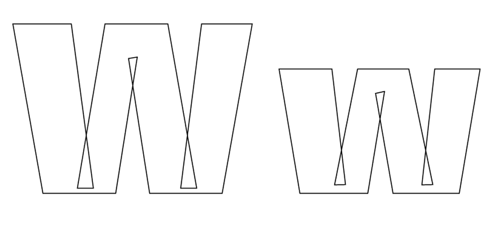
To create the Balto typeface, typographer Tal Leming tried numerous variations of every letter and symbol of the alphabet in various styles. The GIFs above show the transitions from start to finish for the letters G and W, rendered respectively in Balto Black right and Balto Ultra left.